I'm going this year (and it's my first!), so really looking forward to it. It'll be an opportunity to connect with those in the field, and with friends in Seattle and Portland!
http://alamw13.ala.org/
Saturday, December 1, 2012
Monday, November 26, 2012
Meeting with Mackenzie
I'll be meeting with Mackenzie on Tuesday to finalize a solution for the new signs that will replace the outdated signs since the recent move...
Afterwards, I'm going to take those, if needed, to FastSigns and look at options for different types of material. Anyway, I might need to create a semi-permanent location sign until a more permanent solution can be decided on.
Afterwards, I'm going to take those, if needed, to FastSigns and look at options for different types of material. Anyway, I might need to create a semi-permanent location sign until a more permanent solution can be decided on.
Friday, November 23, 2012
November 23
I've reached 150 hours.
Looking at this overall experience, I appreciate the concentrated work I could do independently that ultimately will benefit the library in the months to come. Hopefully, we can work together to address ways in which we can improve the overall user experience within the library. I'm a firm believer that design can play a huge role in providing an "excellent customer experience,"that is eye-opening, thought-provoking, and welcoming. The work I was able to do, along with the readings, I believe have positioned me closer to putting my MLIS to use in the way that fits me well.
Over this week, I'll be continuing to work with Mackenzie in finding a sign solution for the recent move.
Wednesday, November 21, 2012
November 21
Hours logged 147
Bexley has a number of very sturdy, classic yet (unfortunately) permanent signs, that although they look good and are effective for the space, no longer are accurate. Mackenzie has placed temporary signs above the originals but the move will be complete in December, and she'd like something more permanent. I'm going to recreate her temporary sign shown below, and see if it can be integrated into the original sign, or atleast cover it effectively. By the way, these are very expensive looking signs, and they are scattered everywhere. A more permanent solution would be a much larger undertaking than what I can do now, however, it's worth investigating a change and see what will fit with the overall design plan for the building.

Bexley has a number of very sturdy, classic yet (unfortunately) permanent signs, that although they look good and are effective for the space, no longer are accurate. Mackenzie has placed temporary signs above the originals but the move will be complete in December, and she'd like something more permanent. I'm going to recreate her temporary sign shown below, and see if it can be integrated into the original sign, or atleast cover it effectively. By the way, these are very expensive looking signs, and they are scattered everywhere. A more permanent solution would be a much larger undertaking than what I can do now, however, it's worth investigating a change and see what will fit with the overall design plan for the building.

Tuesday, November 20, 2012
November 20
Hours total 146
Today I've worked on creating a staff picks template, and for fun, used Michael Chabon as the "staff" person. Later, I will use Bexley staff member to more realistically show how this might work. I'm not sold yet on the color scheme, but I did want to minimize color to save on printer ink cost. This is example is also a bit wordier than I think is necessary.

Today I've worked on creating a staff picks template, and for fun, used Michael Chabon as the "staff" person. Later, I will use Bexley staff member to more realistically show how this might work. I'm not sold yet on the color scheme, but I did want to minimize color to save on printer ink cost. This is example is also a bit wordier than I think is necessary.

Friday, November 16, 2012
November 16
Total hours 140 hours.
One other option for the author signage, is to go vibrant color with the backgrounds, and black and white with the author images... samples below:


One other option for the author signage, is to go vibrant color with the backgrounds, and black and white with the author images... samples below:


Thursday, November 15, 2012
November 15
Hours logged, 138 total.
Starting creating a "staff favorite" template for Bexley, which features a space for a photo and book covers. It also includes a box to fill in that would include the staff persons readers' profile. Here's the start of the template, of course it will progress with incoming feedback.

Starting creating a "staff favorite" template for Bexley, which features a space for a photo and book covers. It also includes a box to fill in that would include the staff persons readers' profile. Here's the start of the template, of course it will progress with incoming feedback.

Monday, November 12, 2012
November 12
I reached 133 hours today.
It's been a rough day battling technical computer problems with Photoshop and slow connectivity. Still, I managed to complete several non-fiction author signs... here's one:


It's been a rough day battling technical computer problems with Photoshop and slow connectivity. Still, I managed to complete several non-fiction author signs... here's one:


Saturday, November 10, 2012
November 10
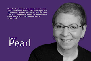
In the last two days, I've worked on the non-fiction end cap Dewey signs. Currently, they are pretty standard and bland, plus are randomly off-center. My idea is to "pos-negative" the image, by lightening the text and darken the background. I think this will help warm the feel of signs and match the eventual endcap signs that will be place above them (the author images). Below is an image for row1, which contains the low 0's through 070's. Nancy Pearl's "Book Lust" titles are in this section, and considering her role in the book and library industry, it seems fitting to include her as an author for that section. My total work hours is at 128 today.


Wednesday, November 7, 2012
November 8
I reached 122 hours as of today.
On Monday, Mackenzie Betts and I took couple hours to walk around the library to look at the various signage needs Bexley needs help with. From the "Welcome" sign at the entrance, to the reading room, staff favorites, and the recent move of the media collection and the new tech center, Bexley has a lot of work related to creating a direct coherent message that works.
Today I've worked on the non-fiction collection endcaps, and here is one of Steven Pinker as an example:

Monday, November 5, 2012
November 5
Hours total: 116
I'm meeting with Mackenzie Betts at Bexley on Monday, so I'm printing off a few samples of the work I've been doing.
Here's a sample page of full color versus monochromatic endcaps, and dewey signs:


I'm meeting with Mackenzie Betts at Bexley on Monday, so I'm printing off a few samples of the work I've been doing.
Here's a sample page of full color versus monochromatic endcaps, and dewey signs:


Saturday, November 3, 2012
November 3
Hours: 112
Stumbled upon this highlight video on youtube, for Library Design Showcase.
What I found useful, is the overall categories they've created to showcase elements of library design that we need to be cognizant of:
A very nice overview of this years Showcase can be found in this article: http://americanlibrariesmagazine.org/librarydesign12
Stumbled upon this highlight video on youtube, for Library Design Showcase.
What I found useful, is the overall categories they've created to showcase elements of library design that we need to be cognizant of:
- Sustainable Construction
- Material Matters
- Navigation and Color
- Children's and Teen Spaces
- Enhanced Functionality
- Outdoor Connections
- Reclamations and Renovations
- Design Details
- Community Living Rooms
A very nice overview of this years Showcase can be found in this article: http://americanlibrariesmagazine.org/librarydesign12
Friday, October 26, 2012
October 26
Hours total: 104
I found this poster, and it gives me a lot to contemplate about the future of libraries in the larger scheme of things culturally.

I found this poster, and it gives me a lot to contemplate about the future of libraries in the larger scheme of things culturally.

Wednesday, October 24, 2012
October 24
Hours total: 98
Here is a sample page of author endcap signs, which is what I've been working on most of the last month:


Here is a sample page of author endcap signs, which is what I've been working on most of the last month:


Monday, October 22, 2012
October 22
Today I've logged 4 hours, total of 86.
Here are a few samples I'm working on for the author endcap signs, using a monochromatic palette...


Here are a few samples I'm working on for the author endcap signs, using a monochromatic palette...


Friday, October 19, 2012
October 19
I've logged 81 total hours.
Here are a few samples of what I've worked on today:


Below I created a sample page to see which layout I thought might work better.
My main question I think I need to tackle, is what will a patron be drawn to? The portrait? The name? The quote? Color? My assumption is that a "face" and color, is going to be the first thing anyone will notice from a distance naturally. Then the name, finally a quote. I think a strong case can be made for a monochromatic appearance, as the face will merge with the color, as opposed to convexly popping out. I feel for the Bexley Library, which is often quiet and has a calmness in its surroundings, I think the more minimal, and contemplative, the more appropriate. Large text I think is out. I would rather think, the image would draw the curiosity of library users, and they will be curious enough to approach the face, and find out who it is, and then read the quote. I also don't want text and image to compete.
Ultimately the goal is to make the stacks a more rewarding and warm experience for users.

Thursday, October 18, 2012
October 18
Today I'm continuing to work through the author signage; finding quotes, cleaning up images, and creating consistency to fit Bexley's overall aesthetic scheme. I'm also working on bookmarks. Here's a couple to start with:


And here are a couple of author signs for the endcaps I'm in the process of making:


Hours total: 76


And here are a couple of author signs for the endcaps I'm in the process of making:


Hours total: 76
Wednesday, October 17, 2012
October 17
I've tallied 9 hours this week so far, and 71 in total.
Still working on endcap signage, and have been in contact with both Rachel and Mackenzie about a photo shoot they are planning for the staff. I'll be the beneficiary of some of these shots, and can't wait to get to work on the Welcome sign.
Below are some great quotes I'm thinking of using for some of the author signs:
“If you only read the books that everyone else is reading, you can only think what everyone else is thinking.”
― Haruki Murakami, Norwegian Wood
“To choose doubt as a philosophy of life is akin to choosing immobility as a means of transportation.”
― Yann Martel, Life of Pi
Monday, October 15, 2012
October 15
Hours logged: 66
Perhaps this would clash with the architecture, but the use of banners on the outside of the building ("Enlighten," "Engage," "Inspire") would be a great way to get the library's mission out in the public eye. Below is a quick sample of what I mean. For expediency sake, I re-used the same face for all 3 images, although if fabricated, I would presume we'd want variety here. The chosen colors are again, just for sample sake. The height and size of the text too is alterable...


Perhaps this would clash with the architecture, but the use of banners on the outside of the building ("Enlighten," "Engage," "Inspire") would be a great way to get the library's mission out in the public eye. Below is a quick sample of what I mean. For expediency sake, I re-used the same face for all 3 images, although if fabricated, I would presume we'd want variety here. The chosen colors are again, just for sample sake. The height and size of the text too is alterable...


Saturday, October 13, 2012
October 13
Hours total: 60
Today I've put in 3 hours, creating signs of Roberto Bolano, Charles Bukowski, Ann Brashares, and Jorge Luis Borges. Here's some experimenting I'm doing below. The color image is the straight-forward, more likely image I'll use, the black and white, might work well with a slight metalic sheen, and then a monochromatic version, which I like, and gives the image a more unobtrusive look. Plus, it'll be easier to fit the image into the color scheme that the library is going for. We'll see!


Today I've put in 3 hours, creating signs of Roberto Bolano, Charles Bukowski, Ann Brashares, and Jorge Luis Borges. Here's some experimenting I'm doing below. The color image is the straight-forward, more likely image I'll use, the black and white, might work well with a slight metalic sheen, and then a monochromatic version, which I like, and gives the image a more unobtrusive look. Plus, it'll be easier to fit the image into the color scheme that the library is going for. We'll see!


Friday, October 12, 2012
October 12
Hours total: 55
Over the last two days, I've had to slow down my progress with creating endcap signs. I spent a long time creating the Jennifer Egan sign, and finding good hi-res images of Saul Bellow in color. I also perused a hundred or so quotes from Margaret Atwood for her sign, and narrowed it to two. I've also created a Atwood bookmark.
This has primarily been spent creating signage templates for a "welcome" sign which contains the library code of conduct, new dewey cards and endcaps for all of the general fiction collection. I've located HI RES images of fiction authors (which will include credits to photographers), and am perusing wayfinding books.
Thursday, October 11, 2012
October 11
Total hours: 50
Currently working on bookmarks, including a template.
Considering the architectural style of the Bexley Public Library, this particular article seems useful in looking at the balance of maintaining historic tradition, yet still modernizing:


Currently working on bookmarks, including a template.
Considering the architectural style of the Bexley Public Library, this particular article seems useful in looking at the balance of maintaining historic tradition, yet still modernizing:
Many people want nothing more than the comfort and quiet dignity of a traditional style when they go to the library. These projects, many of them historic restorations, offer just that.

This renovation manages to balance the solidity and historic style, yet adds a "pop" of color as an accent.

This reading room reminds me a bit of Bexley's, and yet an added natural element (the plants), brings in accents of color without resorting to artificial means.
Wednesday, October 10, 2012
October 10th
Hours total: 47
Grisham!
Couldn't have just McSweeney lit stars could we? I'm trying to get as wide a variety of authors for the endcaps as possible, which includes the automatically recognizable. I found a nice image of John Grisham, from the photographer Daniel Mayer. The second author I've been working on this afternoon is Hari Kunzru, from a photo by Michael Lionstar.
Tuesday, October 9, 2012
October 9th
Hours total: 42
Alright so I got an opportunity to make some headway with finding authors for the endcap panels.
So far today, I've spent close to 5 hours putting these together on CS5. Although I've not nailed down a typeface, font size, or quotes from specific authors, I do have the bulk of the following completed:
Margaret Atwood, Michael Cunningham, Philipa Gregory, Mat Johnson, Etgar Keret, Yann Martel, Haruki Murakami, Julie Orringer, Jodi Picoult, Karen Russell, Danzy Senna, Zadie Smith and Colson Whitehead. Not a bad start!
Basically I've created templates in CS5, inserted a large pdf, HI-RES image, and trimmed and arranged as necessary. For example, here's a photo by Christa Parravani, of the author Julie Orringer. I've eliminated the background, and right-justified in order to leave room for name, and quote. My goal here is to tie-in with the color scheme of Bexley Public Library, and yet keep the focus on author "faces" which I believe will increase the warmth, and stimulate interest and dialogue among browsers.


Saturday, October 6, 2012
October 6
Hours: 36
I popped into the library today to work for a couple hours on finding author images for the fiction endcaps. Here's a sample with the author Zadie Smith, whose recent novel NW, has garnered critical praise from fellow novelist, Ann Enright. "NW represents a deliberate undoing; an unpacking of Smith’s abundant narrative gifts to find a deeper truth, audacious and painful as that truth may be. The result is that rare thing, a book that is radical and passionate and real. "
My goal is to use somewhat muted "quiet" backgrounds, with accents of color, which seems the best fit for the Bexley Public Library's aesthetic. I've yet to nail down a specific typeface and font size, as for now it remains somewhat inelegant.

Friday, October 5, 2012
October 5
Hours logged: 30
Great article!
Great article!
Bad signals
Want to create a hostile library environment? Follow these simple steps:
- Put up as many signs as you can that contain words such as “no,” “must,” “forbidden,” “only,” “prohibited,” and “do not.” And do not neglect the good old circle-slash symbol.
- Use plenty of italics, underlining, and bold-faced text. Better yet, use all three at once.
- Do not scrimp on exclamation points!!!!
-
If you splurge on color, be sure to use plenty of red!!!!
 (What would a customer experience? What would they "feel?" The space is rich, warm, clean and clear.)
More great advice:
What are the core components of poorly designed and low-quality signage?
- The sign, or the lettering on it, is the wrong size—either too small if meant to be read from a distance, or too large if meant to be read close-up.
- The sign is too wordy to take in at a glance.
- The font is not highly legible.
- There is not enough negative space around the lettering.
- There is poor contrast between the color of the lettering and the color of background.
- The meaning of the wording or symbols used on the sign is unclear.
- The sign is made from cheap materials, i.e., paper.
- The sign is poorly mounted: crooked, hung on a uneven surface, or attached with tape or thumbtacks.
- The sign is placed where it is difficult to see or not placed at the point of need.
- The sign is so old it has become shopworn or information is out of date.
Thursday, October 4, 2012
October 4
Hours: 24
Last night I got started work on a template for the dewey decimal signage, that will fit Bexley Library's sign holders. I would have considered replacing these, however they appear to be brass and screwed to the shelving units themselves. The dewey cards that will slide into these brass slots, will be 3x5, and I'm considering color, font size, typeface and what variety of paper they should be printed on. I sent an email to Mackenzie about the Bexley's "official" typeface if they have one.
Today I've been able to get in a good hour or so working on filling in the dewey cards for the stacks.
Currently, the library has extremely specific labels for each row, in which they use actual author names to indicate what (more precisely who) is in that row. For example, "Abbey-Baltuck"/Balzac-Boccaccio." I appreciate this idea, however it's not particularly practical as it doesn't include the entire range of the alphabet. So with the revisions I'm creating, I'm simplifying to:
"A-Bal"/Bal-Boc"
Using up to three letters allows for larger font size, and therefore more readable from a distance.
I finished the templates tonight for the fiction stacks. Luckily I had about 4 hours to work on it. By the way, I'm using Photoshop CS4.
I also began searching for HI-RES author media images for the endcaps. The quality of the images will determine, to some extent, what gets used. So far, some very nice images of Margaret Atwood, Haruki Murakami, Junot Diaz and Ian McKewan.
For inspiration...


Tuesday, October 2, 2012
October 2
Hours: 18
Although it's an overwhelming thought, juggling multiple tasks for my practicum, I've decided to try and clarify (for myself, if anyone), what I need to focus on. I've got a lot of ideas, however, I need to think them through, and make small headways each day.
Today I'm going through several books on library branding, wayfinding, and customer experience design.
Saturday, September 29, 2012
September 29
Really interesting blog on the Seattle Public Library, which discusses the impression the bold design has left on users, good and bad. http://architectureinmedia.wordpress.com/tag/web/

"This collage depicts the mixing chamber on the 5th floor of the Seattle Central Library, on the top of the floating platform dedicated for meeting rooms.

"This collage depicts the mixing chamber on the 5th floor of the Seattle Central Library, on the top of the floating platform dedicated for meeting rooms.
This sort of representations is usually devised not to transmit an actual impression of space, but an intention of experience and atmosphere in a certain space.
In this case, we can observe how patrons and librarians interact in a constant flow of interdisciplinary information, creating a stimulating environment of exchange."Monday, September 24, 2012
September 24
Hours: 14
Still reading through several books... here's a few:
The excellent "Wayfinding Handbook"

Also reading:
Still reading through several books... here's a few:
The excellent "Wayfinding Handbook"

Also reading:
Wayfinding: Designing and
Implementing Graphic Navigational Systems by Craig Berger
Signage Systems and Information
Graphics: A Professional Sourcebook by Andreas Uebele
Tuesday, September 18, 2012
September 18
I wanted to share this video, as it hits on the many exciting changes many libraries are undergoing.
"The Library as we know it is changing..."
".. because of technology, generation differences, and a new set of expectations. No longer is the library seen as a cold building housing old books but a vibrant, active community gathering space where students share their insights and new ideas are brought into the light by trained professionals with advanced internet search techniques. BCI is leading the design of these new library spaces with modern library furniture & shelving systems that promote enlightened environments."Friday, September 14, 2012
September 14
Hours: 10
Recently, I created a "Welcome" sign sample, which combines the "code of conduct", with a person standing along it, representing a staff member. Of course, this could be the director, a librarian, or perhaps a group shot. The point is to connect the code of conduct, and people, as a recognition that these are not just words to modify behavior but a request to "be kind," and thoughtful, and respectful to one another. The physical appearance of a person standing beside the words: Be Kind... can have a psychological priming effect.

Recently, I created a "Welcome" sign sample, which combines the "code of conduct", with a person standing along it, representing a staff member. Of course, this could be the director, a librarian, or perhaps a group shot. The point is to connect the code of conduct, and people, as a recognition that these are not just words to modify behavior but a request to "be kind," and thoughtful, and respectful to one another. The physical appearance of a person standing beside the words: Be Kind... can have a psychological priming effect.

Wednesday, September 5, 2012
September 5
I've found several books today relating to wayfinding signage:
"Where am I? What can I do here? Where can I go from here? How do I get out of here?
Consciously or not, we ask such questions every day as we navigate the places and spaces of our lives."

Hours logged: 8.0
"Where am I? What can I do here? Where can I go from here? How do I get out of here?
Consciously or not, we ask such questions every day as we navigate the places and spaces of our lives."

A great website about great design; the SEGD Global Design Awards:
Hours logged: 8.0
Saturday, September 1, 2012
September 1
I wanted to share this visualization that was used in designing the allocated spaces within the Seattle Public Library. It's and actual visualization of the library’s “programs” via color coordination.


What are the advantages of divying up library space by color, rather than simply creating a text-based sign? I found a great bibliography on ALA's website, on "Building Libraries and Library Additions," which touches on this among other design issues.
Saturday, August 25, 2012
August 25
Love the imagination behind this! Great way to tackle a unique space problem.
"From 12-packs of paper towels to The Count of Monte Cristo: A deserted Wal-Mart in McAllen, Texas, is stocking a new kind of item on its shelves."


"From 12-packs of paper towels to The Count of Monte Cristo: A deserted Wal-Mart in McAllen, Texas, is stocking a new kind of item on its shelves."

"Some of the library’s more charming features include what Horan calls “mega-pendants,” or large signs emblazoned with genre names and designed to make the lofty ceilings seem a little lower."
"Under them are reading nooks they call “respites.” The library also features a quiet room, several computer labs, a small volunteer-run bookstore, and a café."


Thursday, August 23, 2012
August 23
Over the past several months, I've considered the Ingalls Library and Museum Archives, and the Rock and Roll Hall of Fame Library and Archive, but had to rule these out due to travel concerns... it just wasn't realistic. So, having already met with the director of the Billy Ireland Cartoon Library & Museum, however, logistically it was bad timing unfortunately. A year ago, I was planning on parlaying an internship experience at the Columbus Museum of Art, into a practicum. But the library was mostly in need of an archivist or a cataloger. Neither pulled me in that direction, so I opted out. While looking around for other options, I spoke to the Director of the Bexley Public Library, Rachel Rubin about a potential project that involved my area of interest: Visual communication within the physical space of the "brick and mortar" library. As much as the focus is turning towards the web presence a library presents, I still enjoy getting my hands "dirty" as it were, and producing "objects" within a public space. Considering that this might be an opportunity that would lead to the fabrication of some of my ideas involving signage, and the general changes in the aesthetics of a space, I jumped at it. So that's where I'm at, much of what I'll be working on is "theoretical" really, but I'll will be atleast creating examples which can be eventually fabricated. Next step? Perusing and taking notes in the stacks of the Bexley Library!
Daily log: 2.0 hours
Daily log: 2.0 hours
Subscribe to:
Posts (Atom)